
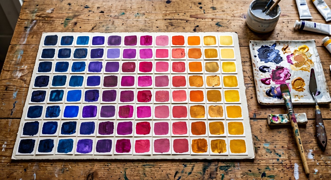
Color in Nakshora 3.0 follows one grammar: <utility>-<palette>-<shade>. text-blue-500, bg-slate-900, border-rose-200, from-indigo-400 — once you know one, you know them all.
The 22 palettes#
| Palette | Character | Start here |
|---|---|---|
slate | Cool blue-gray — the default neutral for modern UIs. | colors/slate|slate → |
gray | Pure neutral gray — maximally quiet. | colors/gray|gray → |
zinc | Slightly cool metallic gray — great for developer tools. | colors/zinc|zinc → |
neutral | True neutral — no hue at all. | colors/neutral|neutral → |
stone | Warm gray with an earthy cast. | colors/stone|stone → |
red | The alarm color — errors, destructive actions, urgency. | colors/red|red → |
orange | Energetic and warm — warnings and bold CTAs. | colors/orange|orange → |
amber | Golden — caution, highlights, rating stars. | colors/amber|amber → |
yellow | Bright attention — markers, badges, sunlight. | colors/yellow|yellow → |
lime | Electric green-yellow — energy and freshness. | colors/lime|lime → |
emerald | Jewel green — success, money, growth. | colors/emerald|emerald → |
green | Pure green — confirmation and nature. | colors/green|green → |
teal | Blue-green balance — calm precision. | colors/teal|teal → |
cyan | Aqua — technical clarity and cool accents. | colors/cyan|cyan → |
sky | Daylight blue — openness and lightness. | colors/sky|sky → |
blue | The classic UI blue — trust, links, primary actions. | colors/blue|blue → |
indigo | Deep blue-violet — sophistication and focus. | colors/indigo|indigo → |
violet | Royal purple — creativity and premium feel. | colors/violet|violet → |
purple | Classic purple — imagination and luxury. | colors/purple|purple → |
fuchsia | Magenta punch — bold highlights. | colors/fuchsia|fuchsia → |
pink | Playful warmth — consumer and social. | colors/pink|pink → |
rose | Red-pink romance — alerts with elegance. | colors/rose|rose → |
Every shade has a job#
| Shade | Role |
|---|---|
50 | Lightest tint — page backgrounds, subtle fills, hover backgrounds for rows and list items. |
100 | Very light — section backgrounds, badges on light UI, tinted code blocks. |
200 | Light — borders on light themes, dividers with personality, chip backgrounds. |
300 | Soft — secondary borders, disabled states with color, placeholder decorations. |
400 | Medium-light — icons on dark surfaces, decorative accents, chart lines. |
500 | The primary step — buttons, links, brand fills, key interactive elements. |
600 | Hover step — hover states for 500 elements, or primary on very light UIs. |
700 | Active step — pressed states, emphasized text on light tinted backgrounds. |
800 | Dark — text on light palettes, headers in tinted sections, dark UI fills. |
900 | Very dark — deep section backgrounds, high-contrast text carriers. |
950 | Darkest — near-black tinted backgrounds, hero surfaces, footer tones. |
Where colors plug in#
Text colortext-<palette>-<shade> everywhere.Background colorbg-* with opacity modifiers.Border colorborder-*, divide-*, ring-*.Gradientsfrom-/via-/to- stops.
Accessibility#
Contrast is a property of *pairs*, not colors. The rule of thumb that keeps you WCAG AA: 50–400 shades carry dark text, 600–950 shades carry white text. Each palette page lists the flip point. See accessibility/color-contrast|Color contrast for measurements.
Tip. Opacity modifiers work on every color utility:
bg-blue-500/50, text-white/80, border-black/10.