
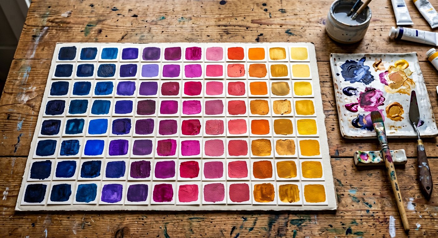
Color in Nakshora 2.0 follows one grammar: <utility>-<palette>-<shade>. text-blue-500, bg-slate-900, border-rose-200, from-indigo-400 — once you know one, you know them all.
The v2 color engine#
v2 generates from a 50-color engine with 10 shades each, surfaced through the five theme presets. Pick a theme and its palettes come with it — see themes/index|Themes & presets.
Every shade has a job#
| Shade | Role |
|---|---|
50 | Lightest tint — page backgrounds, subtle fills, hover backgrounds for rows and list items. |
100 | Very light — section backgrounds, badges on light UI, tinted code blocks. |
200 | Light — borders on light themes, dividers with personality, chip backgrounds. |
300 | Soft — secondary borders, disabled states with color, placeholder decorations. |
400 | Medium-light — icons on dark surfaces, decorative accents, chart lines. |
500 | The primary step — buttons, links, brand fills, key interactive elements. |
600 | Hover step — hover states for 500 elements, or primary on very light UIs. |
700 | Active step — pressed states, emphasized text on light tinted backgrounds. |
800 | Dark — text on light palettes, headers in tinted sections, dark UI fills. |
900 | Very dark — deep section backgrounds, high-contrast text carriers. |
950 | Darkest — near-black tinted backgrounds, hero surfaces, footer tones. |
Where colors plug in#
Text colortext-<palette>-<shade> everywhere.Background colorbg-* with opacity modifiers.Border colorborder-*, divide-*, ring-*.Gradientsfrom-/via-/to- stops.
Accessibility#
Contrast is a property of *pairs*, not colors. The rule of thumb that keeps you WCAG AA: 50–400 shades carry dark text, 600–950 shades carry white text. Each palette page lists the flip point. See accessibility/color-contrast|Color contrast for measurements.
Tip. Opacity modifiers work on every color utility:
bg-blue-500/50, text-white/80, border-black/10.