
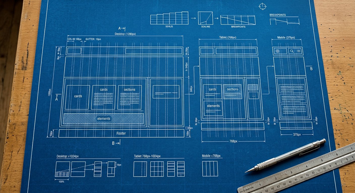
lg: targets laptops — everything from 1024px wide. Laptops. The desktop layout usually lands here: multi-column grids, persistent navbars, side panels.
What usually changes here#
- The canonical desktop layout
- Grids: 3 → 4 columns
- Hero sections go side-by-side
Example#
<div class="grid grid-cols-2 lg:grid-cols-4 gap-6">…</div>Combining#
Stack with the other screens and with variants: lg:hover:bg-blue-600, dark:lg:bg-slate-900. Order: screen first, then state.
Related screens#
responsive/md|md: (768px) · responsive/xl|xl: (1280px) · responsive/breakpoint-strategy|Breakpoint strategy