
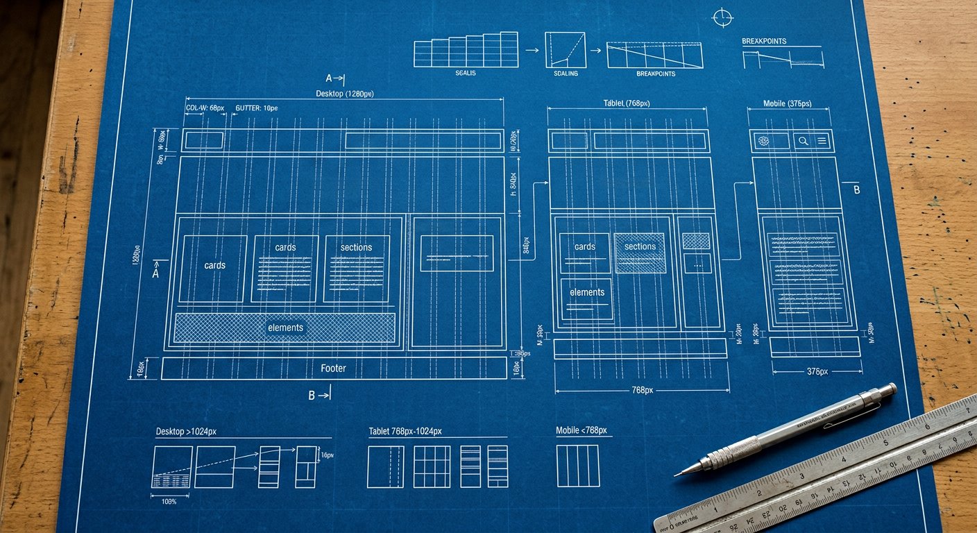
The complete Responsive Design collection for this release — 6 pages across 2 categories. This hub is the spoke-center: every page below links back here, and every page here links forward.
Browse by category#
| Category | Pages |
|---|---|
| Responsive | Breakpoint strategy · Responsive design |
| Responsive · Screens | The lg: screen (1024px) · The md: screen (768px) · The sm: screen (640px) · The xl: screen (1280px) |
How hubs work#
Nakshora Docs uses a hub-and-spoke internal linking model: hubs gather related detail pages, detail pages carry breadcrumbs back, and related-links connect siblings. Follow any chain — every path deepens.