
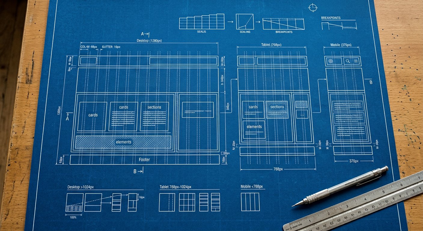
Nakshora is mobile-first: unprefixed utilities apply everywhere, and each screen prefix layers an override from that width up. No media-query code, ever.
The screens#
| Prefix | Min width | Targets | Example |
|---|---|---|---|
xs: | 480px | small phones | xs:grid-cols-2 |
sm: | 640px | large phones | sm:grid-cols-2 |
md: | 768px | tablets | md:grid-cols-2 |
lg: | 1024px | laptops | lg:grid-cols-2 |
xl: | 1280px | desktops | xl:grid-cols-2 |
2xl: | 1536px | large desktops | 2xl:grid-cols-2 |
Mental model#
<div class="grid grid-cols-1 sm:grid-cols-2 lg:grid-cols-4 gap-4">
  <!--
    base : 1 column   (< 640px)
    sm:  : 2 columns  (≥ 640px)
    lg:  : 4 columns  (≥ 1024px)
  -->
</div>
The three rules#
- Style the smallest screen first (no prefix).
- Each prefix ADDS from its width up — you never undo.
- Test at the breakpoints between screens, not only on them.
Tip. Design content-first: let YOUR content choose breakpoints. The defaults cover 95% of products — see responsive/breakpoint-strategy|breakpoint strategy.