
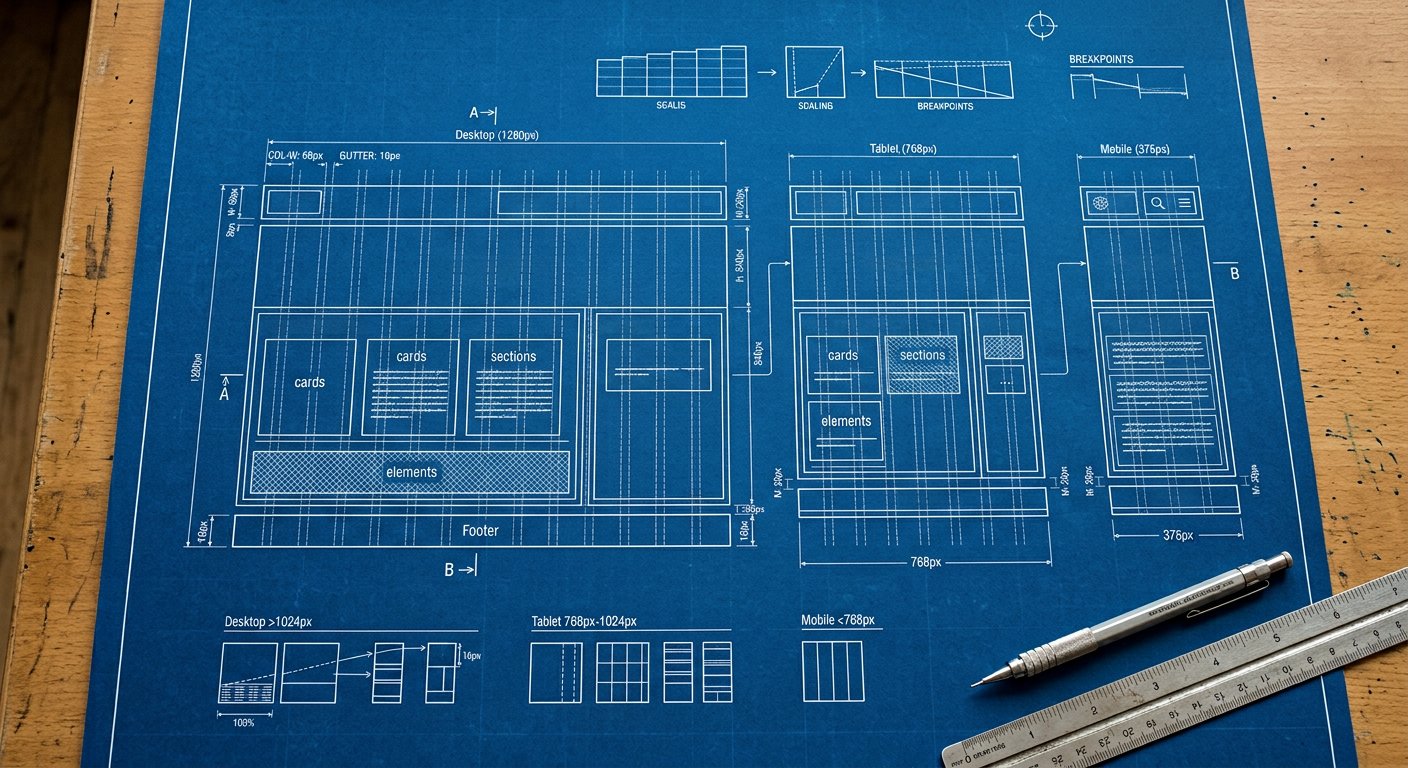
Base styles target small screens; screen prefixes layer up. The mental model that makes responsive design effortless.
The idea#
Base styles serve the smallest screen; each screen prefix adds overrides from that width up. You never "undo desktop styles on mobile" — you only ever add. The result: less CSS, fewer bugs, and layouts that degrade gracefully downward.
In practice#
example
<div class="grid grid-cols-1 md:grid-cols-2 xl:grid-cols-3 gap-4">
  <!-- 1 column by default, 2 from 768px, 3 from 1280px -->
</div>
Common mistakes#
- Designing desktop first and fighting to shrink it
- Using max-width queries when a min-width prefix reads better
- Forgetting that unprefixed classes apply at ALL widths
Keep learning#
Next: concepts/design-tokens|Design tokens and utilities/index|the utilities reference put this concept to work. For the big picture, see getting-started/introduction|the introduction.