
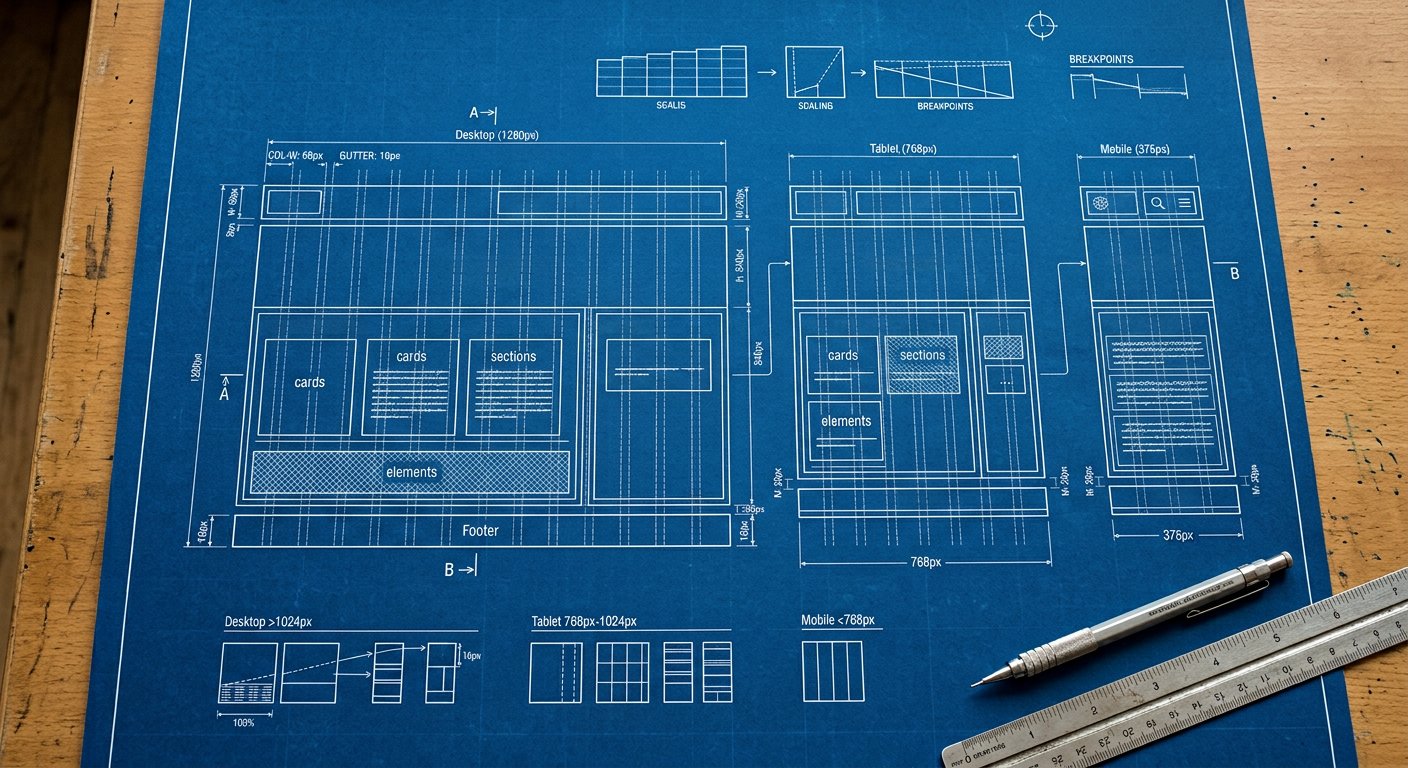
xxl: targets large desktops — everything from 1536px wide.
What usually changes here#
- Layout adjustments appropriate to this width
Example#
<div class="p-4 md:p-8">…</div>Combining#
Stack with the other screens and with variants: xxl:hover:bg-blue-600. Order: screen first, then state.
Related screens#
responsive/xl|xl: (1280px) · responsive/uhd|uhd: (2560px) · responsive/breakpoint-strategy|Breakpoint strategy