
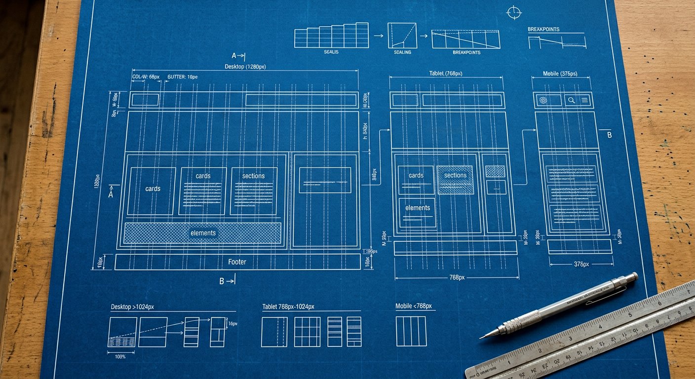
Amateurs pick breakpoints from device lists. Professionals pick them from content breakpoints — the widths where YOUR layout becomes uncomfortable.
The workflow#
- Build the mobile layout completely (no prefixes).
- Grow the viewport; note where it breaks.
- Fix THAT break with the nearest screen prefix.
- Repeat until 2560px.
- Only then check real analytics widths.
The three-device myth#
There are not three screen sizes. There are hundreds. The Nakshora scale (ten screens) exists so you almost never need a custom one — but the workflow above is what keeps markup clean.
Audit#
Questions per breakpoint:
- Does navigation collapse/expand here?
- Do cards reflow here?
- Does type scale here?
- Does padding breathe here?Pro tip. Keep a WRITTEN breakpoint contract in your design system docs: what changes at each screen. This page is a template.