
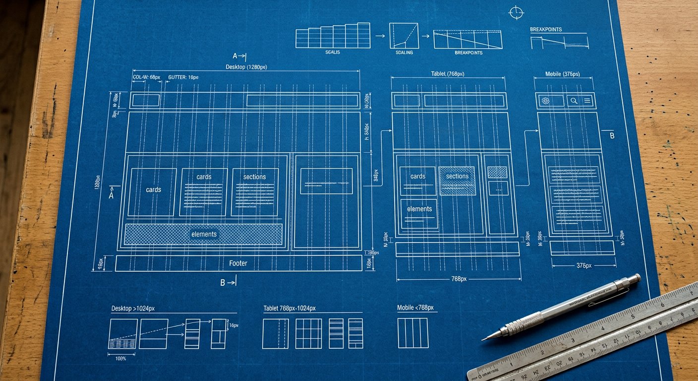
xxs: targets tiny / folded screens, wearables — everything from 200px wide. Wearables, folded outer screens and embedded widgets. Rarely styled explicitly — but when you do, xxs: beats a magic-number media query.
What usually changes here#
- Simplify to single columns
- Enlarge tap targets
Example#
<div class="grid grid-cols-1 xxs:grid-cols-2 gap-2">…</div>Combining#
Stack with the other screens and with variants: xxs:hover:bg-blue-600, dark:xxs:bg-slate-900. Order: screen first, then state.
Related screens#
responsive/xs|xs: (400px) · responsive/breakpoint-strategy|Breakpoint strategy