
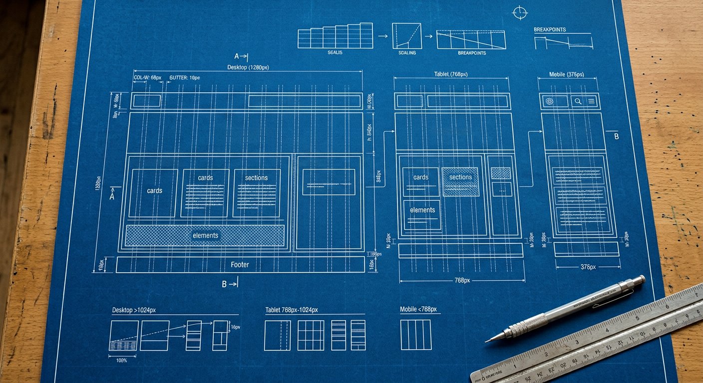
Sometimes a rule is genuinely "small screens only" — max-* variants express that directly.
<nav class="hidden max-md:flex">Mobile-only nav element</nav>
<div class="p-2 max-sm:p-1">Tighter on the smallest phones</div>
How it compiles#
/* max-md:p-2 */
@media (max-width: 767.98px) { .max-md\:p-2 { padding: 0.5rem } }
When to use which#
| Goal | Use |
|---|---|
| Add style as screens grow | min-width prefixes (md:) |
| Remove/simplify below a width | max-* prefixes |
| Hide on phones | max-md:hidden OR hidden md:block — pick one convention |
Warning. Do not mix both conventions for the same element — teams pick ONE and document it.