
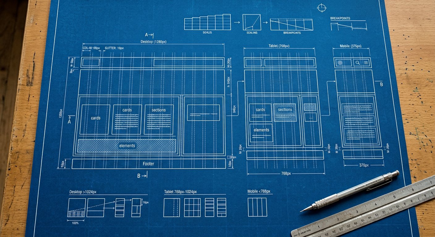
xs: targets small phones — everything from 400px wide. Small phones (400px+): the first place a two-up layout becomes thinkable, and where compact padding starts paying off.
What usually changes here#
- Chip rows wrap less aggressively
- 2-column micro-grids become viable
Example#
<div class="flex flex-col xs:flex-row gap-4">…</div>Combining#
Stack with the other screens and with variants: xs:hover:bg-blue-600, dark:xs:bg-slate-900. Order: screen first, then state.
Related screens#
responsive/xxs|xxs: (200px) · responsive/sm|sm: (640px) · responsive/breakpoint-strategy|Breakpoint strategy