
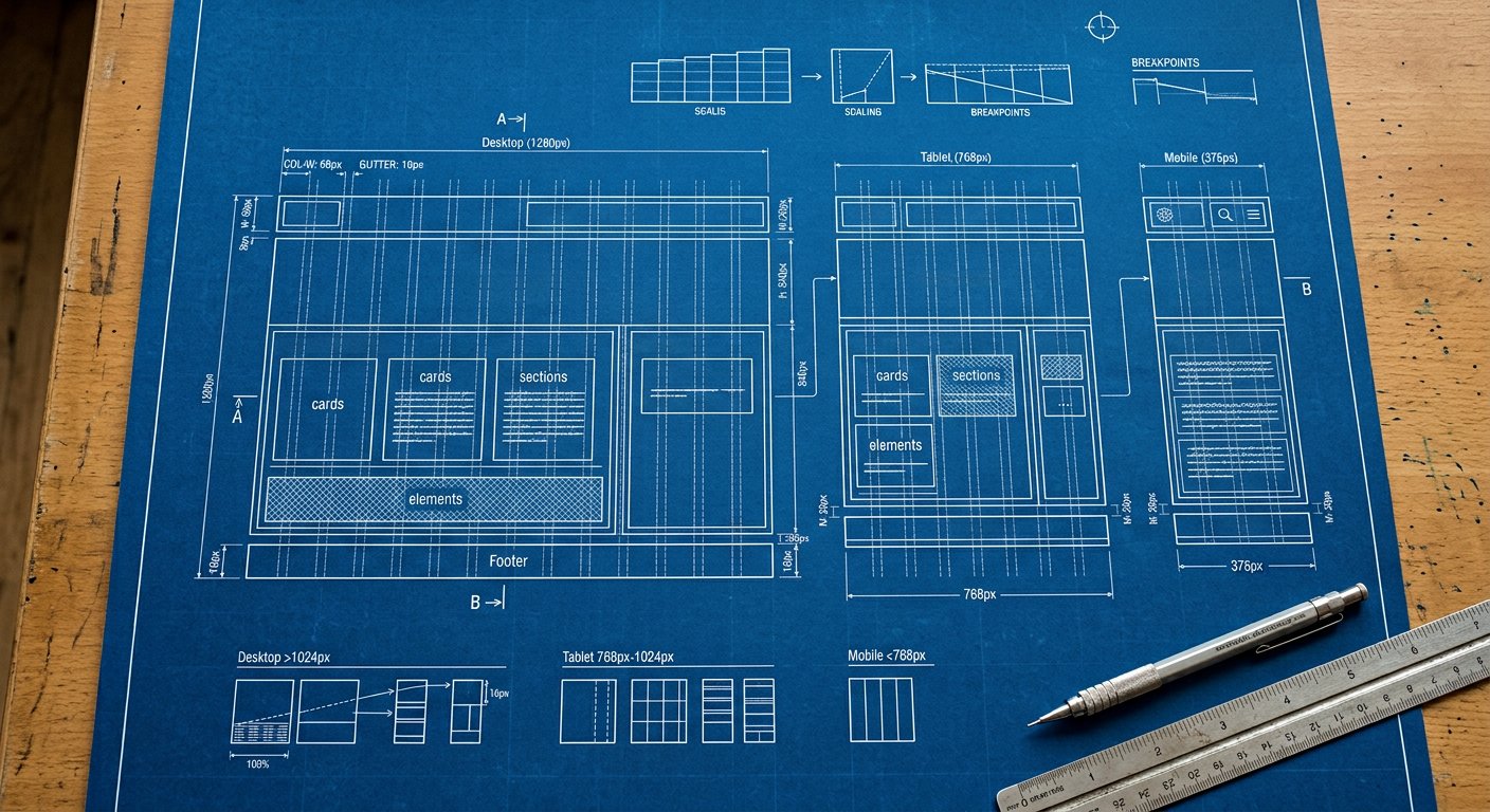
The rem-based scale behind every margin and padding: 0, px, 0.5 … 96 — and how to extend it.
Classes#
reference
p-4  →  padding: 1rem
mt-2.5 → margin-top: 0.625rem
w-16 → width: 4remExample#
example
p-4  →  padding: 1rem
mt-2.5 → margin-top: 0.625rem
w-16 → width: 4rem
Responsive & variants#
Every class here accepts screen prefixes (xxs: … 5xl:) and state variants — md:hover:p-4 style stacks compile to a single media query. See responsive/index|Responsive design and variants/index|Variants.
Best practices#
- Stay on-scale: 4, 6, 8, 12, 16, 24 are the rhythm points
- Extend, don't fork: theme.extend.spacing keeps the scale coherent
Common mistakes#
- Arbitrary pixel values everywhere defeats the design system
Related#
utilities/spacing/spacing-scale|Spacing scale · utilities/sizing/width|Width · comparisons/margin-vs-padding|Margin vs padding