
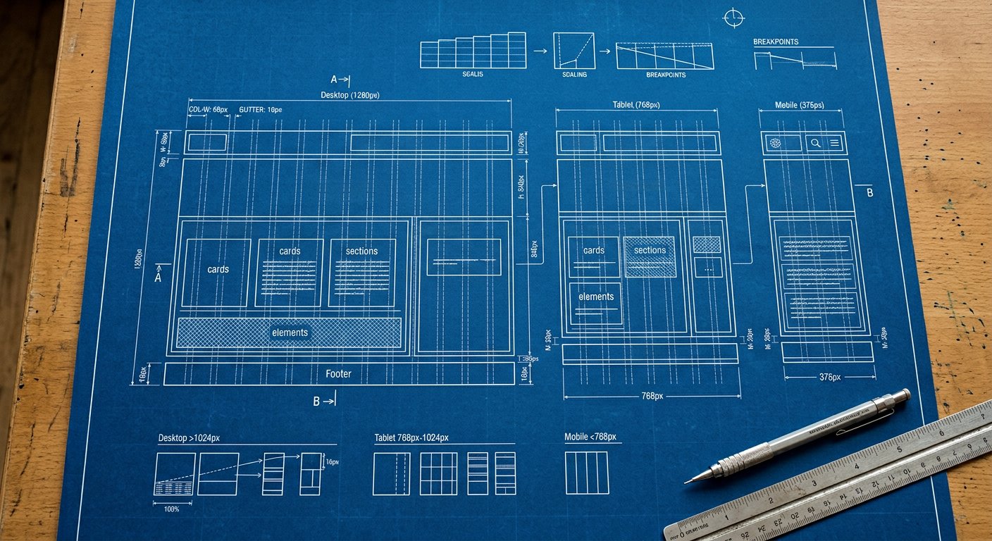
Visually hide content while keeping it for screen readers — and reveal on focus. This family contains 2 generated classes in Nakshora 3.1.
Classes#
| Class | Generated CSS |
|---|---|
sr-only | position: absolute; width: 1px; height: 1px; padding: 0; margin: -1px; overflow: hidden; clip: rect(0, 0, 0, 0); white-space: nowrap; border-width: 0; |
not-sr-only | position: static; width: auto; height: auto; padding: 0; margin: 0; overflow: visible; clip: auto; white-space: normal; |
Example#
example
<a href="#main" class="sr-only focus:not-sr-only">Skip to content</a>Responsive & variants#
Every class here accepts screen prefixes (xxs: … 5xl:) and state variants — md:hover:p-4 style stacks compile to a single media query. See responsive/index|Responsive design and variants/index|Variants.
Best practices#
- Skip links: sr-only + focus:not-sr-only
- Never use display:none for a11y-relevant text
Related#
utilities/interactivity/cursor|Cursor · utilities/interactivity/scroll-snap|Scroll snap