
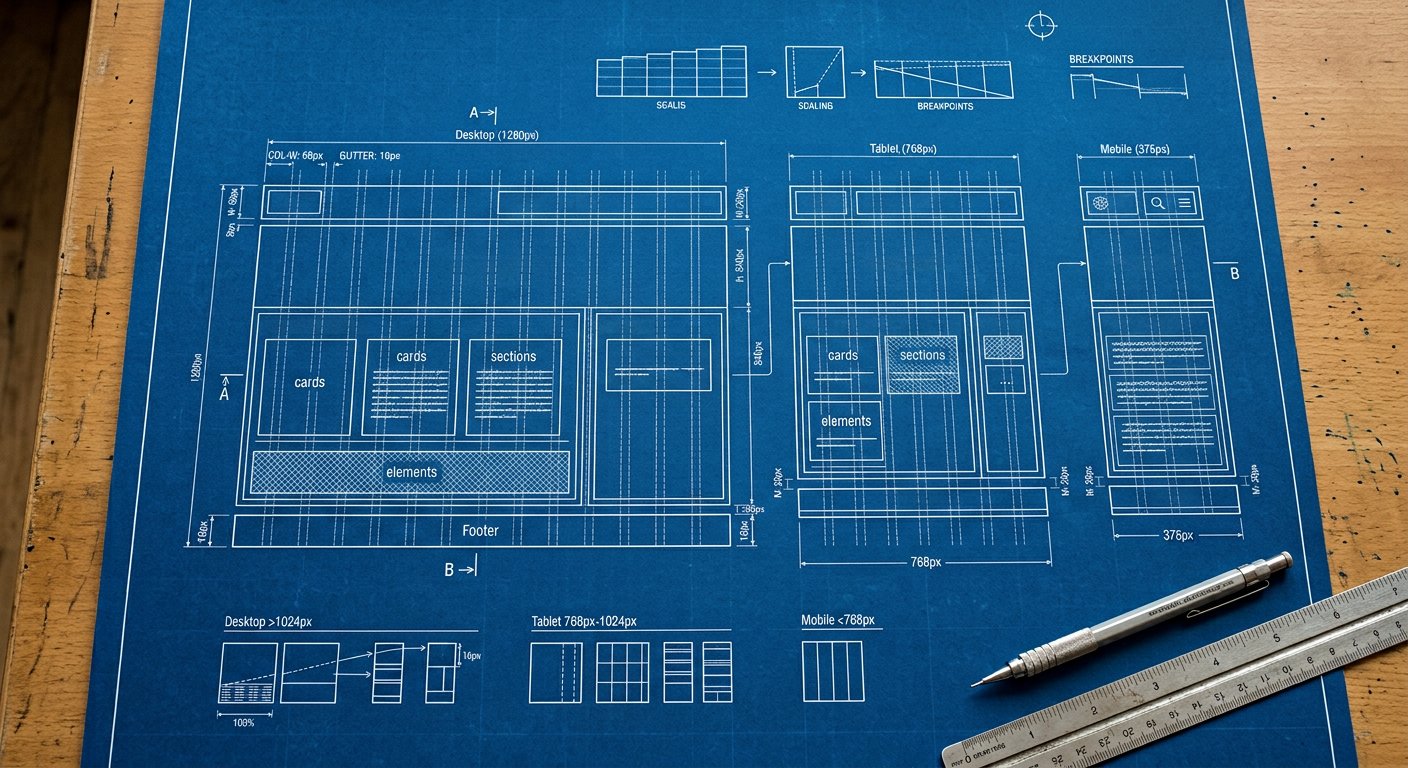
Decision guide: when to reach for grid vs flexbox, with the same layout built both ways.
Classes#
reference
<!-- one axis of content → flex. two axes → grid. -->Example#
example
<!-- one axis of content → flex. two axes → grid. -->Responsive & variants#
Every class here accepts screen prefixes (xxs: … 5xl:) and state variants — md:hover:p-4 style stacks compile to a single media query. See responsive/index|Responsive design and variants/index|Variants.
Best practices#
- Rows of things (nav, chips): flex
- Layouts with rows AND columns: grid
- Both compose: grid for page, flex for components
Related#
utilities/flexbox/flex-direction|Flexbox · utilities/spacing/gap|Gap