
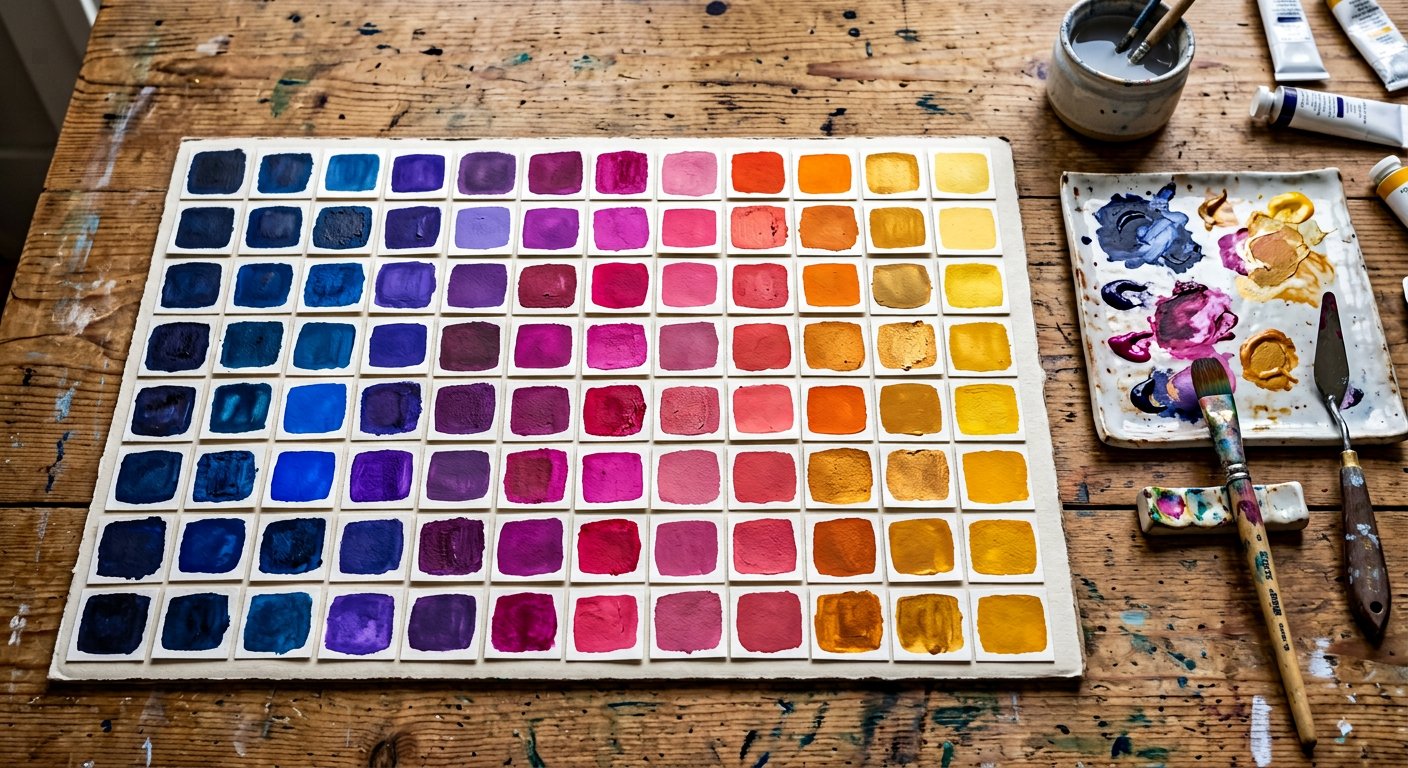
neutral-600 is step 600 of the colors/neutral|neutral palette — hover step — hover states for 500 elements, or primary on very light uis.
Token#
| Property | Value |
|---|---|
| Class fragment | neutral-600 |
| Approximate value | #525252 |
| CSS variable | --color-neutral-600 |
| Text on top | text-white |
| Role | Hover step — hover states for 500 elements, or primary on very light UIs. |
In a layout#
<button class="bg-neutral-600 hover:bg-neutral-700 text-white px-5 py-2.5 rounded-lg">Primary</button>Neighbors#
Darker: colors/neutral-700|neutral-700 · Lighter: colors/neutral-500|neutral-500 · colors/neutral|Palette hub