
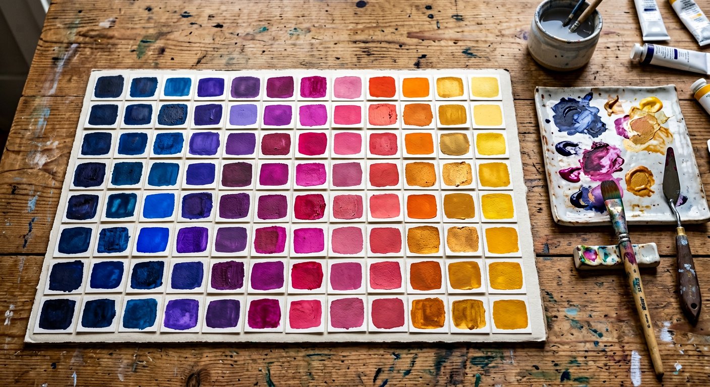
Great UIs use one dominant palette, one neutral, one accent. Here are pairings that always work with the Nakshora scale.
The pairings#
| Dominant | Neutral | Accent | Feel |
|---|---|---|---|
blue | slate | amber | Trustworthy SaaS |
violet | zinc | cyan | Modern developer tool |
emerald | stone | orange | Organic / fintech |
rose | neutral | indigo | Consumer / lifestyle |
indigo | gray | pink | Creative platform |
teal | slate | fuchsia | Dashboard / data |
The 60-30-10 rule#
60% neutral surfaces (slate-50/slate-950), 30% secondary (cards, borders at 100–300), 10% dominant+accent (buttons, links, highlights). The design/color-theory|color theory guide goes deeper.
Pro tip. Commit your trio to theme.extend.colors as
primary, surface, accent — then ban raw palette names in components.